Changing people & planet, one plate at a time

The client and the challenge

Building a brand that delivers a personalised, planet-based diet.

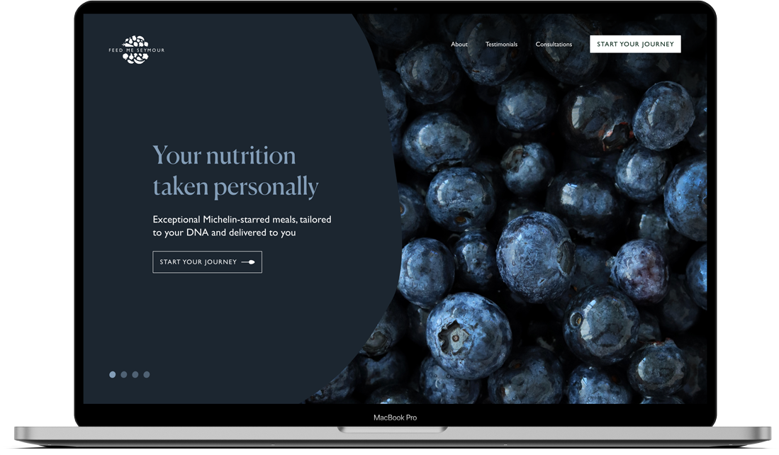
What happens if you cross Deliveroo with Heston Blumenthal? You get exceptional food tailored to your body’s DNA and delivered to your desk. In short, you get Feed Me Seymour.

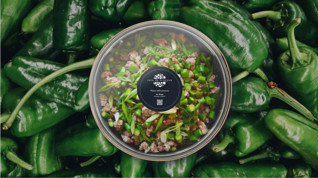
Feed Me Seymour’s DNA-based meals promote mental and physical wellbeing, are prepared by Michelin-starred chefs, and as they’re mostly plant-based, they’re as good for the planet as they are for you.

What they needed now was a brand to plate up their offering — and serve it in style.

The strategy

Scratch-cooking the brand

Understanding their customers’ DNA is vital to Feed Me Seymour’s proposition. So we thought the same idea should apply to making their brand a mouthwatering prospect to its customers.

We created a brand essence formed from ‘DNA’, literally — ‘Delicious, Nutritious, Accessible.’ These would be the three brand pedestals upon which their design and messaging would sit.

That meant creating a brand that looks as delicious as the product. A brand whose communications had to espouse its nutritious benefits, for people and planet. And a brand that was accessible for those wanting to improve their eating habits without the hassle.

Woven did an amazing job of unpacking the fundamentals of the brand, in a way that never lost focus on delivering business value. They captured the essence of what we were trying to do while pushing us in exciting new directions.

Matthew de Nobrega - Founder & CTO, Feed Me Seymour

Getting the recipe right

Great food depends on the vision of the people making it. A brand is no different. To help plate up Seymour’s vision, we gave them an Explorer archetype to reflect the team’s adventurous spirit and to inspire pioneering, purpose-driven branding and communications.

We also formulated their mission, vision and value proposition, so any member of the Feed Me Seymour team can quickly understand what the business stands for and how it should present itself.

The result

Looking good enough to eat

Having created Seymour’s tone of voice, we then crafted a rich, inviting aesthetic reflecting the provenance of the produce and the skill of the team. We combined intense colours and elegant fonts with close-ups of delectable foods to create a look that’s every bit as inviting as the food Seymour serves up.

We encapsulated all this with a logo that shows the brand’s playful, accessible side; one that says, while the mission couldn’t be more serious, there’s still fun to be had in completing it.