The client

Turning Knight Frank’s print publication, The View, into a digital destination

Knight Frank have been at the forefront of property consultancy since 1896, selling incredible homes, offering financial advice, and providing key insights into the world’s luxury goods markets.

With such a broad range of knowledge, it makes sense Knight Frank also publish a magazine — called The View — that shines a spotlight on the people, places and property that inspire their high-net-worth audience.

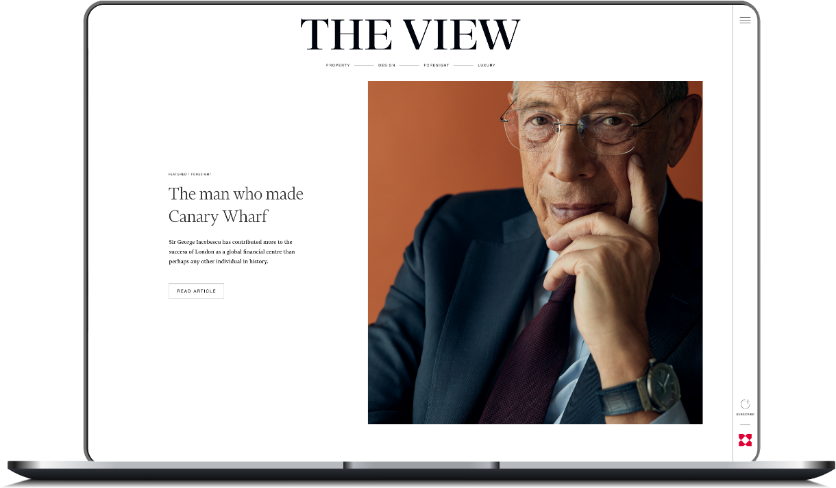
The View homepage

The challenge

Translating print into pixels

While Knight Frank’s target market appreciates the traditional touch of a print publication, their younger audiences are spending more and more time online. And because all brands need to be where their audiences are, Knight Frank asked us to create a website version of The View.

Having already delivered a stand-out campaign for 2022’s The Wealth Report, Knight Frank were confident we’d be up to the task. And, even though we say so ourselves, we didn't let them down.

The View is everything we wanted it to be: elegant, engaging and easy to read. We've captured the essence of the print publication and made it relevant to Knight Frank's digital audience.

Rich Boyle — Creative Director, Woven

How we did it

Our brief was to build an online destination in the form of a new website. While we had to echo The View’s print publication — so that users would know they were one and the same — we still had some flex in how best to translate print into pixels.

We presented three different styles spanning a spectrum of creativity and innovation vs accessibility and usability. In the end, we chose a middle way — one that emphasised the elegant feel our target audience appreciates, while still being easy to navigate and read.


Life, styled.

This ethos of ‘aspirational accessibility’ ran throughout the project. The View exists to give readers an insight into the world’s cultures and lifestyles, to show what it’s like to be part of these places. This is the aspiration.

But it also has to cater for different ages and encourage users to read long-form copy, so it was designed to mirror the accessibly elegant style of the print publication, while including navigational tools such as tags and categories to help readers find content suited to their tastes.

The result

Our digital version of The View is an exercise in editorial beauty. It uses plenty of white space to maximise the photography’s impact and make its long-form copy easy and inviting to read.

And because it’s been designed with a mobile-first approach — and in an easy-to-update grid that can flex for future issues — we’ve delivered a website that’s inspirational, timeless, accessible and easy for the client to manage.

Check out The View here — and our 2022 Wealth Report work here.