Yes, the golden arches is more than a logo. It’s a sigil deep-rooted in our culture, hard-coded into us during our informative years, when we learned that eating out was about friends and family, salt and sugar — and usually a corresponding trip to the cinema.
For such simple pleasures, McDonald’s created a simple logo. But the road to simplicity is often a complex one…
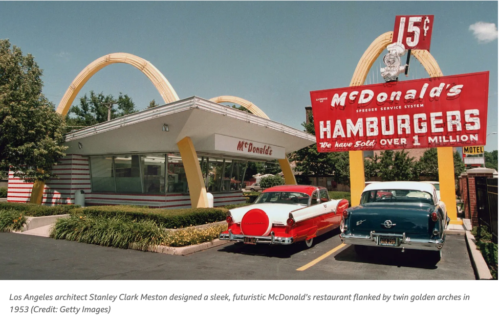
The original arches design came about in 1952 — but not as a logo. Instead, the arches were a central design feature for their actual restaurants. The brothers wanted something that would stand out and be original.
It was Richard McDonald who came up with the design for the new building. He envisioned the place as a simple burger stand, but with arch-shaped semicircles on each side. In his rough sketch of the idea, he referred to them as “The Golden Arches.”
The brothers set about finding an architect who could transform their sketch into a reality. After meeting with several architects — none of whom liked the design — they met Stanley Clark Meston.
Meston looked at the sketch and accepted their proposal. Unknowingly agreeing to design the symbol of a future corporate giant.
The first restaurant carrying this new design opened in Phoenix, Arizona in May 1953. As originally planned, all franchises that followed were required to use the same design.


In 1955, Ray Kroc joined the McDonalds as franchise manager under a deal that would see the brothers making a percentage of every franchise that Ray sold. The relationship was soured by the fact that Ray felt he wasn’t making enough from his side of the deal and the brothers were not keen on the expansion ideas that Ray wanted to put into place.
This resulted in Ray Kroc buying McDonald’s in 1961 from the brothers in a deal worth $2.7m. Under Kroc’s leadership, McDonald’s began its rapid expansion and the logo evolved once again, this time incorporating the golden arches present in the architecture.
Kroc asked McDonald’s president, Fred Turner, to come up with a new logo for the business. Turner, at first attempting to design the logo himself, eventually passed it on to Jim Schindler, head of engineering and design. It was Schindler who sketched out the first logo to incorporate the golden arches. He also included a slanted line running through the “M” to represent the sloping roof of the restaurants.

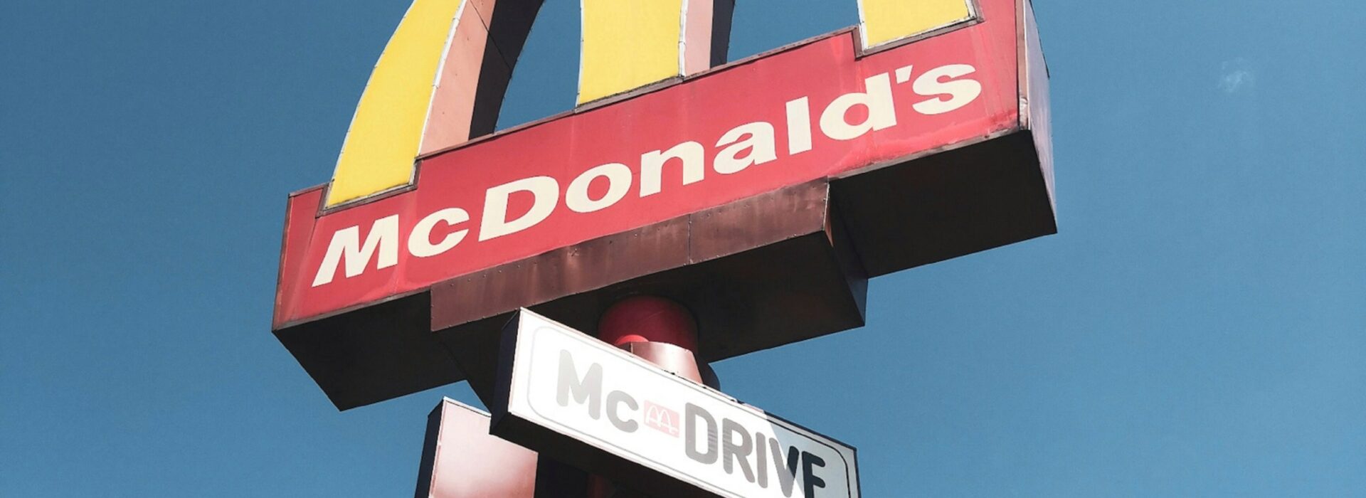
In 1968, the logo was changed once again, removing the slanted line, moving the arches further apart and creating the now iconic “M” shape that is still in use today.
Interestingly, Ray Kroc actually intended to do away with the golden arches altogether and rebuild the brand in his name. But Louis Cheskin, a design consultant hired by the corporation, changed his mind — and preserved one of the world’s most famous icons by doing so.
And it’s a good job, because the power of the golden arches is such that they’ve been used to convey everything from home delivery (courtesy of Leo Burnett), signposting, and capturing that McDonald’s feeling with the ‘Raise Your Arches‘ campaign.


The versatility of the McDonald’s logo isn’t an accident. Its simple design and playful brand positioning allow for endless creative expression that means McDonald’s, just like with their food, always deliver.